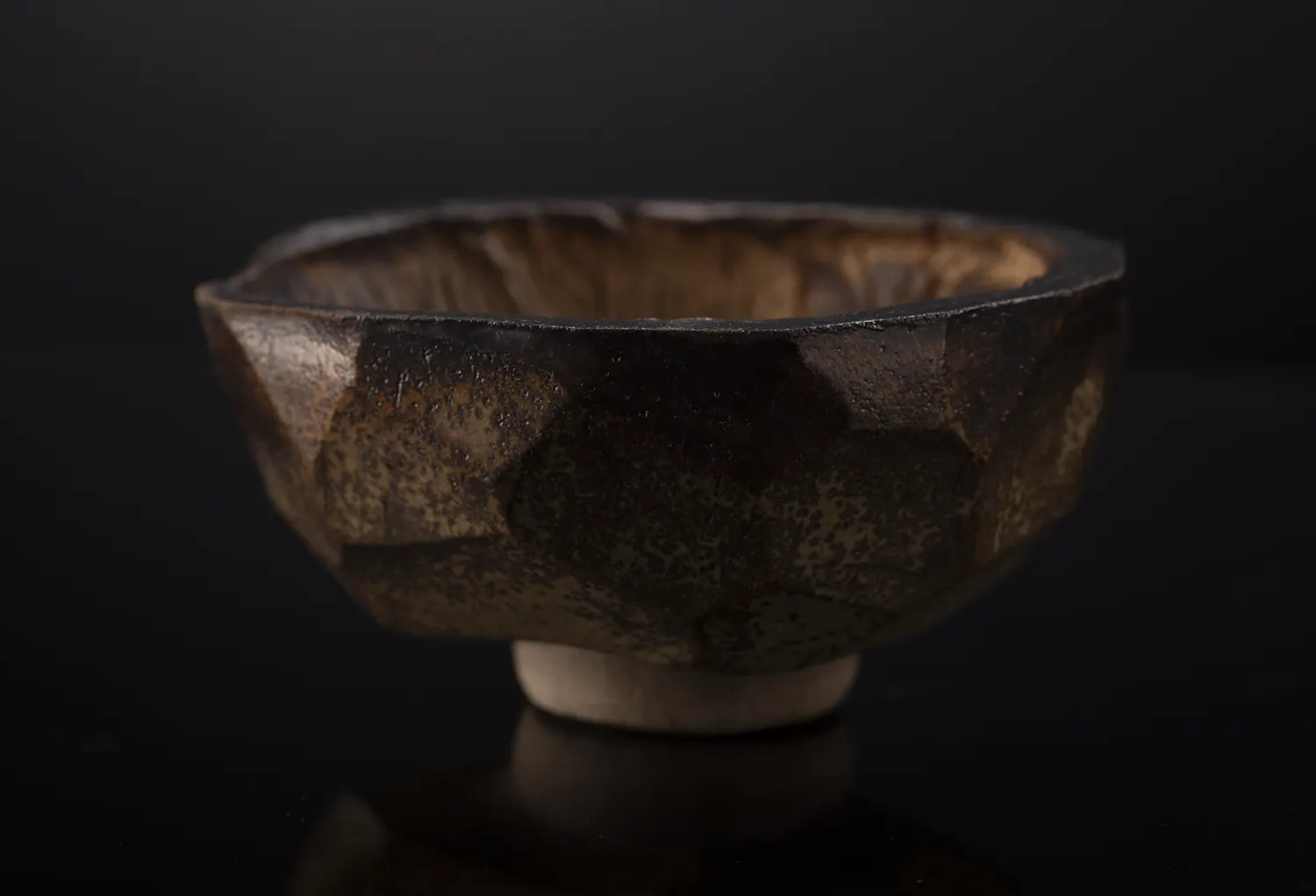
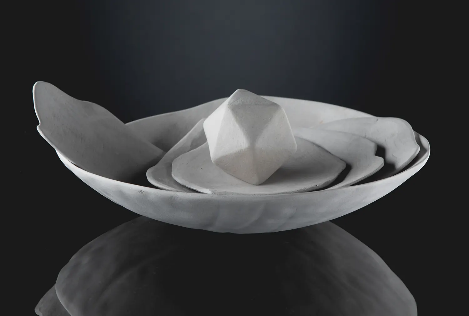
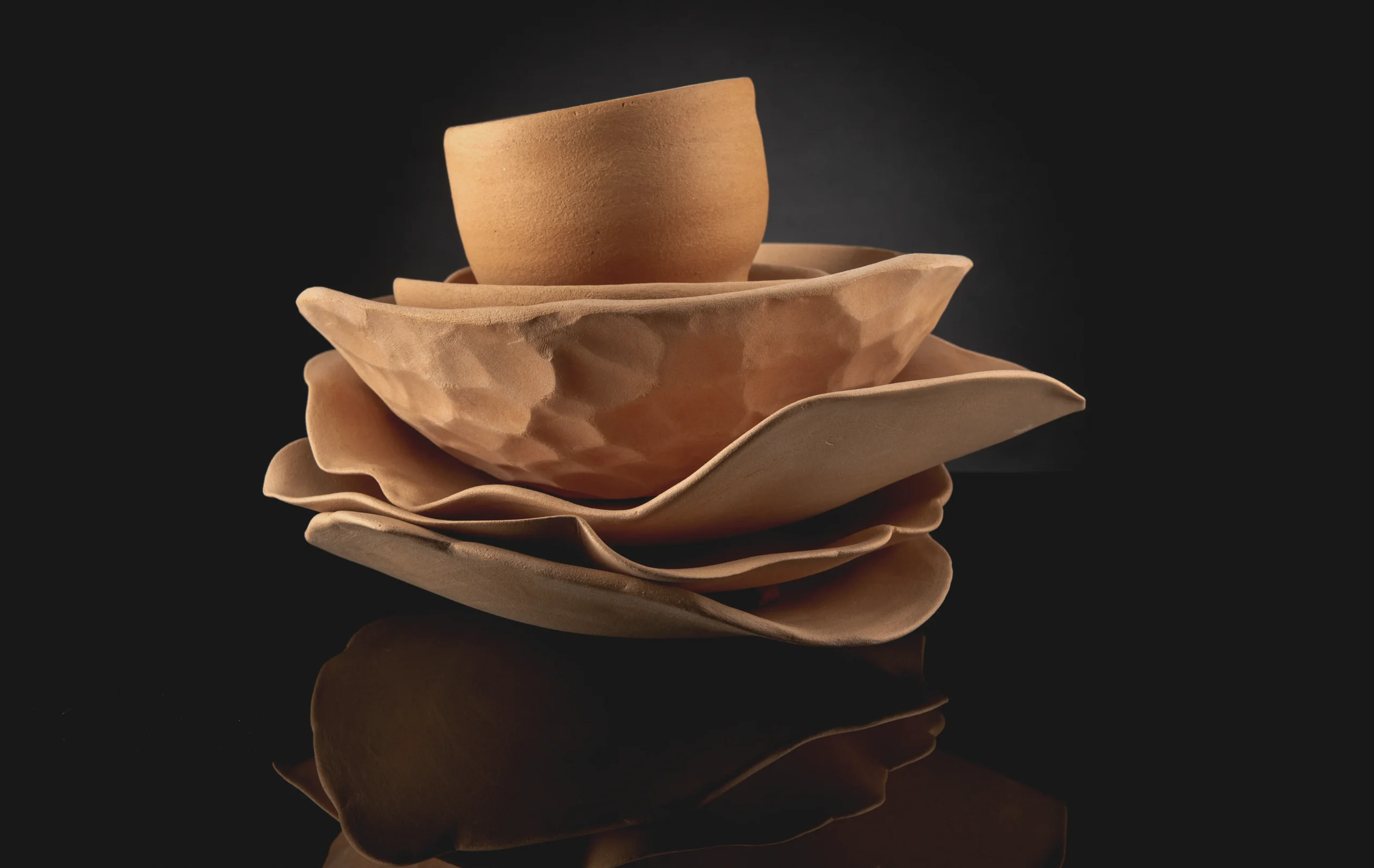
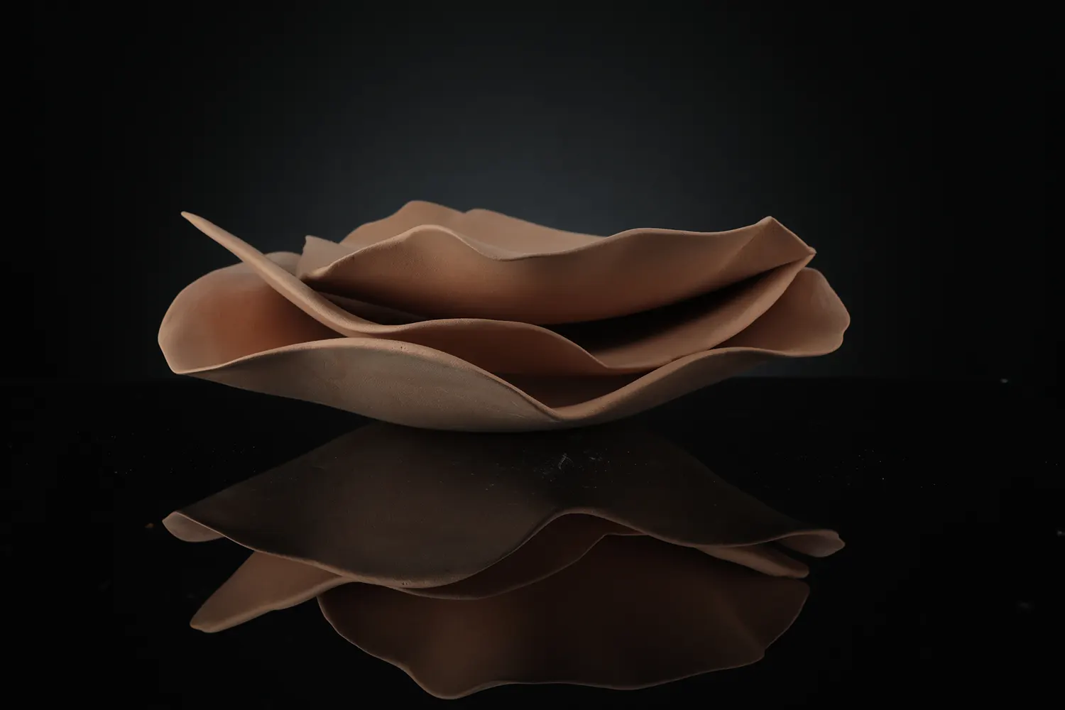
“Branding the product was the first order of business,” says art director Harry Macheras at Happy Artists. We had to come up with a name that both appealed to artists and costumers and spoke to the essence of product. The products are simple and honest. It is straightforward. What is more appealing about HAKU is its simplicity of form – Harry wanted to get back to the basic elements of design, to step away from gimmicks and excess.
Haku Ceramics & Pottery
The brand was named HAKU, shortened to HK. Perhaps the biggest challenge was speaking to the handcrafting artists community in a new and effective way. “A very fast growing community which is bombarder with new products and technics every day”. Says Harry-“Handcrafting artists like other artists , are also very particular about what the like and what they don’t like. They have a good sense of style and appreciate good artworks.”
What we did
- Art direction
- Branding
- Packaging
Client
- Haku Ceramics & Pottery
- Our gifted planet and its core is the source of our expression as we stand visitors in time.
- #Water #soil #air #fire #life


